The Lab Entrance
Conversion first Web design Websites that grow businesses Strategy-led websites designed to turn attention into leads, inquiries, and real business
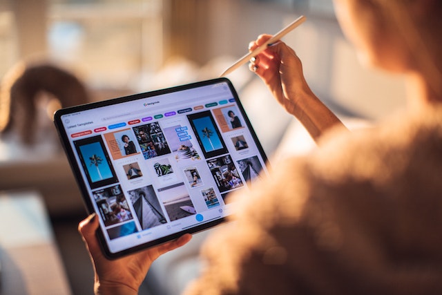
Website cards are an integral part of modern web design. They provide a concise preview of content, helping users to quickly understand and navigate a site’s offerings. When designed well, cards can significantly improve a website’s aesthetics and user experience. Here are some top tips to design eye-catching and functional website cards.
The primary purpose of a website card is to give a snapshot of information. Whether it’s an article, a product, or a profile, the content should be immediately clear.
Clear Imagery: Choose images that resonate with the content. Opt for high-quality visuals that look good even when resized.
Legible Typography: Ensure text is easily readable. Avoid using fonts that are too ornate or sizes that are too small.
Consistent Layout: For sites with multiple cards (like a blog or store), maintain consistency in the card design to make the browsing experience seamless.

A cluttered card can deter users. By embracing white space, or ‘negative space’, you make your cards more readable and visually appealing.
Interactive elements can elevate the user experience.
Hover Effects: Add subtle animations or color changes when the user hovers over a card. This makes the browsing experience more dynamic and indicates interactivity.
Call-to-Action (CTA): If your card aims to drive action (like reading a blog post or buying a product), include a clear CTA. Make it stand out, but ensure it doesn’t overpower the other content.
Colors can evoke feelings and actions. Be mindful of the colors you choose.
With mobile browsing on the rise, your cards should look and function perfectly on all devices.
Responsive Design: Cards should adjust in size and layout according to the screen size.
Touch-friendly: Ensure buttons and links are large enough to tap easily on touch screens.
As with all design elements, it’s crucial to test your cards with real users and iterate based on feedback.
A/B Testing: If possible, run tests to see which card designs perform best in terms of user engagement.
Feedback: Regularly collect feedback and be open to making changes.
Website cards are more than just design elements; they’re crucial tools for engagement. By prioritizing clarity, making strategic color choices, and ensuring a responsive design, you can craft cards that aren’t just beautiful but also functional. Remember, the key is to keep the user at the heart of your design process.
Conversion first Web design Websites that grow businesses Strategy-led websites designed to turn attention into leads, inquiries, and real business
Design Systems XXL Container – 120px top and bottom XL Container – 100px top and bottom L Container – 80px